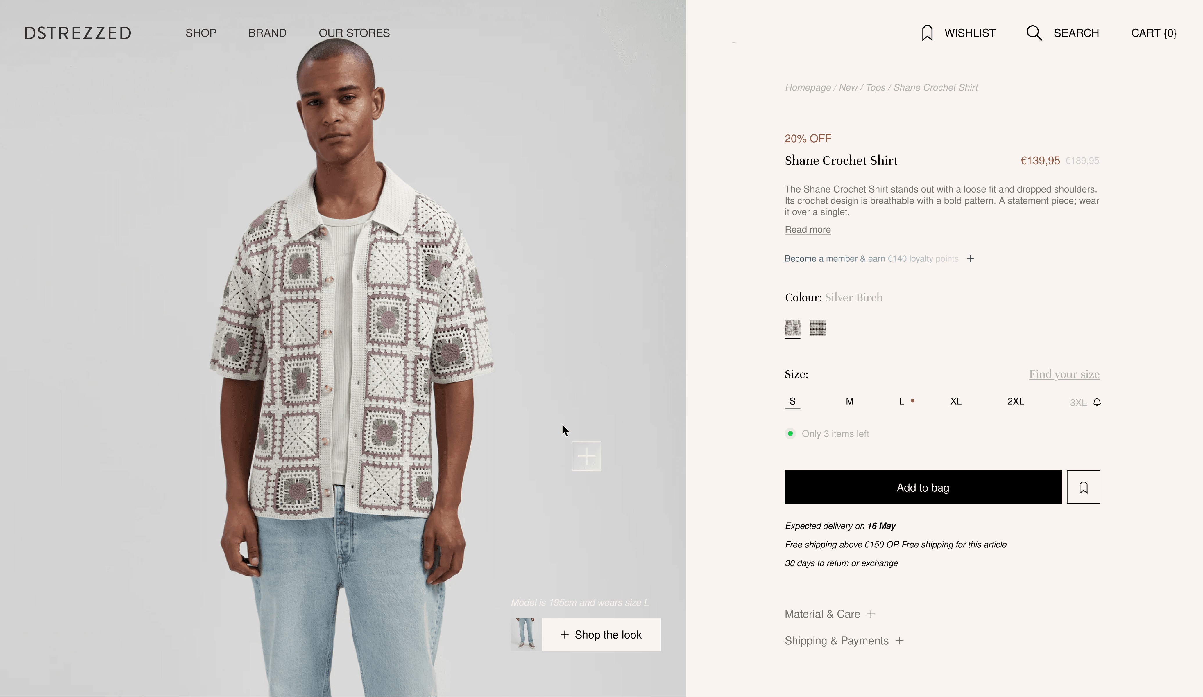
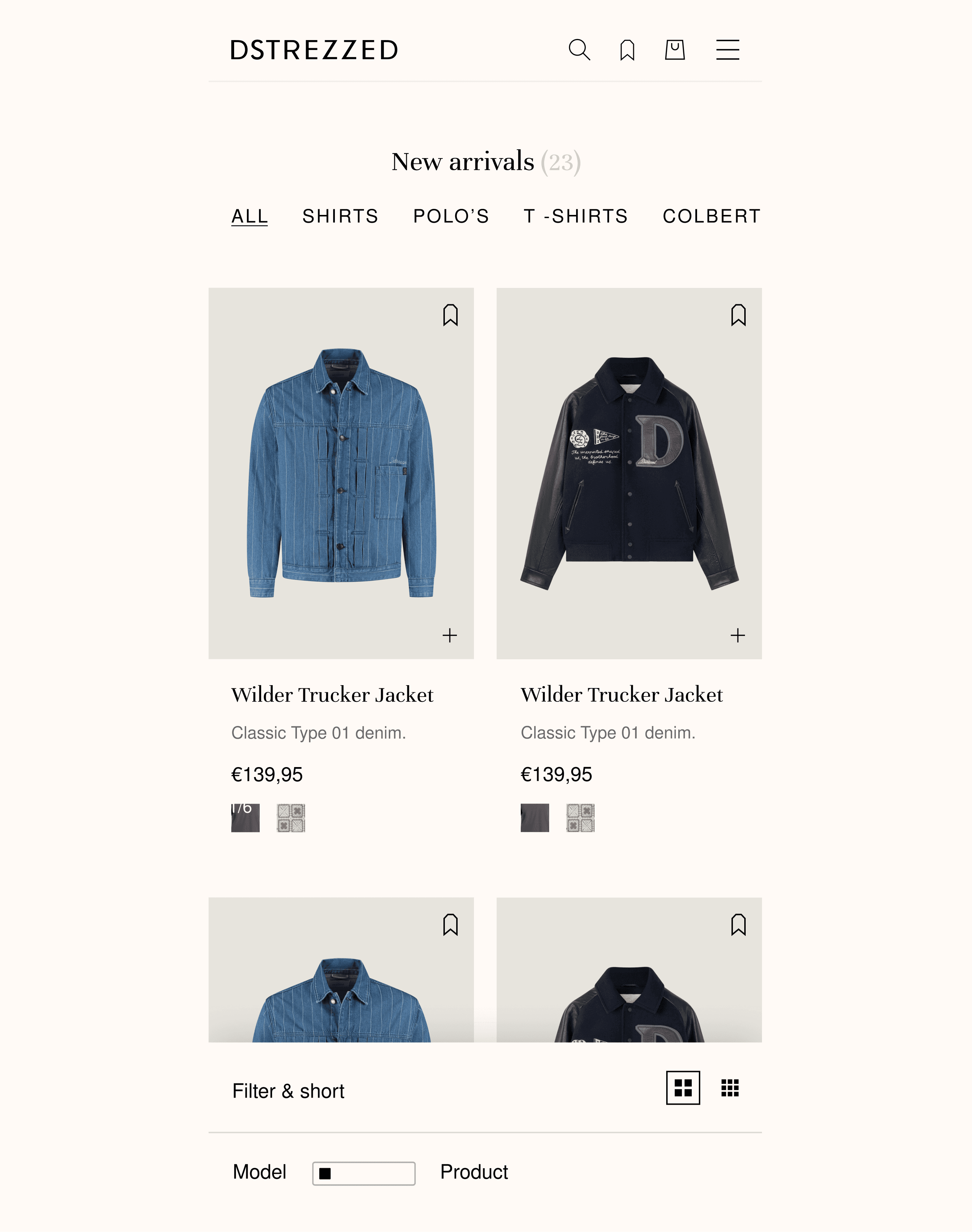
Project cover image for this 55N case study.

DSTREZZED

DSTREZZED

DSTREZZED

Year

Year

2026

2026

Scope

Scope

Web design

Web design

(01) Project description

Brief

Dstrezzed is a Dutch menswear brand with physical stores across the Netherlands, Belgium, and France — the website wasn't converting at the level the brand deserved.

Dstrezzed is a Dutch menswear brand with physical stores across the Netherlands, Belgium, and France — the website wasn't converting at the level the brand deserved.

Dstrezzed is a Dutch menswear brand with physical stores across the Netherlands, Belgium, and France — the website wasn't converting at the level the brand deserved.

Dstrezzed is a Dutch menswear brand with physical stores across the Netherlands, Belgium, and France — the website wasn't converting at the level the brand deserved.

Dstrezzed is a Dutch menswear brand with physical stores across the Netherlands, Belgium, and France — the website wasn't converting at the level the brand deserved.

Full website redesign covering all key screens — homepage, PLP, PDP, fit guide, journal, stores, fabrics, and a complete design system. Both visual direction and UX were in scope, built to convert better while elevating the brand into a more editorial, premium tier.

(02) Solution

Brief

The visual direction shifted from a functional retail site to a branded editorial experience — warm cream backgrounds, refined typography, and model-first imagery that lets the clothes take center stage. The result feels closer to a menswear magazine than a webshop.

The visual direction shifted from a functional retail site to a branded editorial experience — warm cream backgrounds, refined typography, and model-first imagery that lets the clothes take center stage. The result feels closer to a menswear magazine than a webshop.

The visual direction shifted from a functional retail site to a branded editorial experience — warm cream backgrounds, refined typography, and model-first imagery that lets the clothes take center stage. The result feels closer to a menswear magazine than a webshop.

The visual direction shifted from a functional retail site to a branded editorial experience — warm cream backgrounds, refined typography, and model-first imagery that lets the clothes take center stage. The result feels closer to a menswear magazine than a webshop.

The visual direction shifted from a functional retail site to a branded editorial experience — warm cream backgrounds, refined typography, and model-first imagery that lets the clothes take center stage. The result feels closer to a menswear magazine than a webshop.

The PDP and PLP were redesigned around conversion — size selection surfaced directly on the product card, a model/product toggle on the PLP, stock indicators, and a quick-add flow that reduces steps to purchase. The fit guide and fabrics pages give customers the confidence to buy without visiting a store.

Project visual — design work shown in context.
Project visual — identity and layout detail.
Project visual — interface or brand application.
Project visual — design detail from the case study.
Project visual — layout and typography detail.
Project visual — design detail from the case study.

(03) Impact

Brief

The redesign gave Dstrezzed a digital presence that matches the quality of its physical stores — coherent, elevated, and built to perform across NL, BE, FR, UK, and beyond.

The redesign gave Dstrezzed a digital presence that matches the quality of its physical stores — coherent, elevated, and built to perform across NL, BE, FR, UK, and beyond.

The redesign gave Dstrezzed a digital presence that matches the quality of its physical stores — coherent, elevated, and built to perform across NL, BE, FR, UK, and beyond.

The redesign gave Dstrezzed a digital presence that matches the quality of its physical stores — coherent, elevated, and built to perform across NL, BE, FR, UK, and beyond.

The redesign gave Dstrezzed a digital presence that matches the quality of its physical stores — coherent, elevated, and built to perform across NL, BE, FR, UK, and beyond.

A full design system ensures the brand scales consistently — from campaign drops to editorial journal content — without losing the visual integrity of the redesign.

More projects